Red Dead Redemption 2
Improving a classic?
It’s not easy trying to improve a game that is close to perfection however I feel that the Character Creation UI is not as efficient as it could be. This area holds potential for improvement, and I'm eager to explore creative avenues to elevate the player experience.
Pain points

During the design review, I examined the menu screens closely, looking for areas to make better. I concentrated on making things work faster, improving how people think about using the menus, and creating a more enjoyable and smooth experience for players.
-
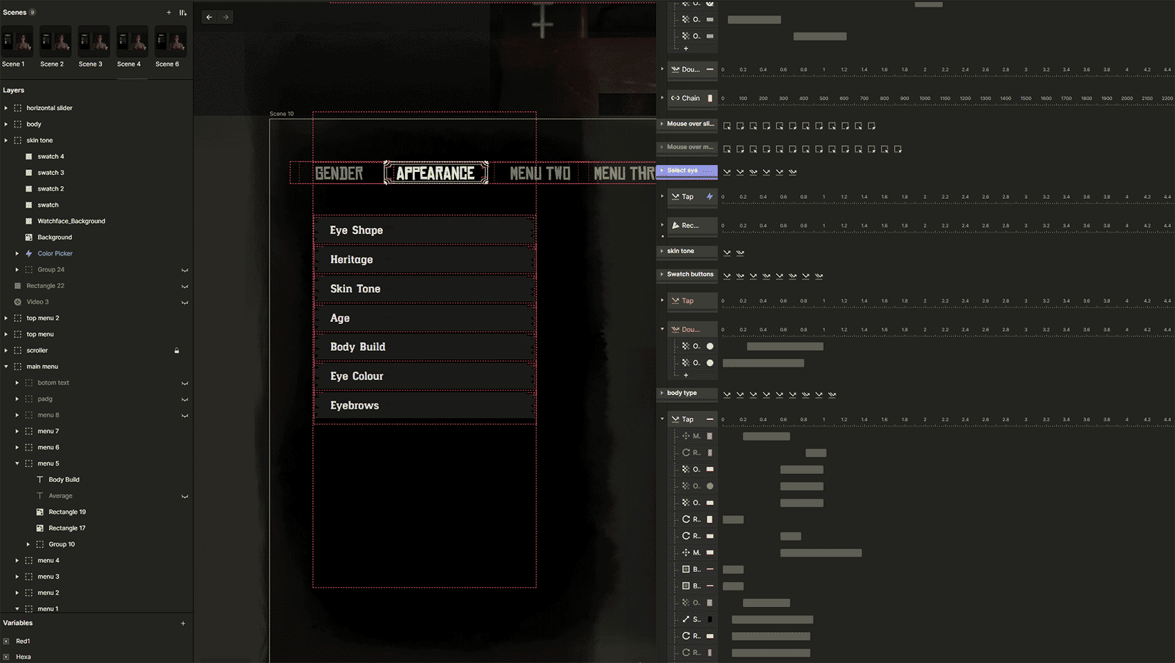
The current menu design pattern is restricted in width in order to allow the player to fully see the character as they make choices. However, this limited width results in the player having to scroll through up to 17 menu items, with only 7 visible on the screen at any given time. The presence of off-screen options also poses a challenge in terms of discoverability.
-
The small secondary window requires multiple clicks, increasing effort to access options. Placing the interaction window below the main menu detaches selection from the menu, making it harder for players to make choices.
Designing a solution
Interaction
With pain points identified, I introduced a menu system that would expand and collapse to show more items at once and create a larger area for player interaction. This would still leave plenty of space for players to see the character system feedback as they build their character.

User Flows
I approached the task with a clear target in mind, focusing on enhancing the design of three menu sections to refine the user experience whilst making sure the new designs and interactions remain faithful to the RDR design system.
I selected the following menu components to concentrate on and thoroughly examined how this innovative approach would significantly enhance the overall player's experience.
Skin Tone
Body Build
Eye Shape

Hi-Fidelity Screens
1: Eye Shape Selection

I explored using a more interactive and visually engaging approach to allow players to select their game character's body type. Instead of a traditional menu, the player can scroll through an array of diverse body shapes displayed in a stylish wanted poster format, adding an element of fun and personalization to the gaming experience.
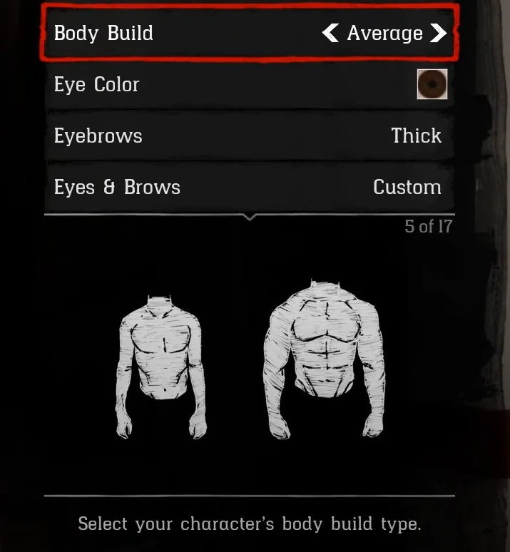
RDR 2: Body selection screen
Updated Skin Tone screen
Updated Body Selection screen
2: Skin Tone
Introduced a color wheel that simplifies the process of selecting skin tones. This feature, combined with skin tone swatches, enables customers to engage in a more interactive and personalized experience. By offering a wider range of skin tones, we empower the player to find the perfect match, ultimately enhancing their immersion in the game.
RDR 2: Skin Tone screen


3: Body Selection
The new design makes it easier for players to navigate. When they open the main menu, they can smoothly scroll through all the eye shapes. This makes it much quicker to browse and choose, without being limited to seeing only three at a time, this new design significantly minimizes the number of user clicks required for browsing and making selections.

Prototyping: Protopie
After creating the design elements such as buttons, backgrounds, and posters in Photoshop. I exported the elements into Adobe XD and then into Protopie.
Protopie allows for a richer interactive prototyping experience allowing me to balance the interaction and transitional effects when the menus and various CTAs are interacted with.